
Brands That Refuse to Whisper - And Why It Works
Why do some brands feel impossible to ignore?
Some brands don’t whisper. They don’t hedge their bets or try to please everyone. They show up with big personality, clear direction, and zero apologies and it works.
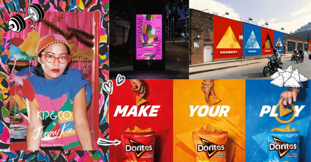
Think about brands like Kip and Co, Brisbane Festival, or even Doritos. Completely different industries, different audiences, different price points. Yet they share one powerful advantage. You recognise them instantly.
This is not luck. It is strategy.
If your business has big energy but your brand is blending into the background, the problem is rarely effort. It is usually clarity.
Isn’t bold branding risky for a small business?
It can feel that way. Many business owners worry that standing out will turn people off. But the real risk is being forgettable.
Kip and Co are a perfect example. Their products are colourful, layered, and unapologetically expressive. They do not dilute their style to appeal to everyone. Instead, they double down on it across packaging, photography, typography, and styling.
Takeaway 1: Choose three core visual traits that define your brand personality and use them everywhere. For example, a specific colour palette, a consistent photography style, and one strong font pairing. Consistency turns bold into recognisable, not chaotic.
When the right people see you repeatedly showing up the same way, trust builds faster.

Do you need complicated design to stand out?
Not at all. In fact, simplicity with confidence is often more powerful.
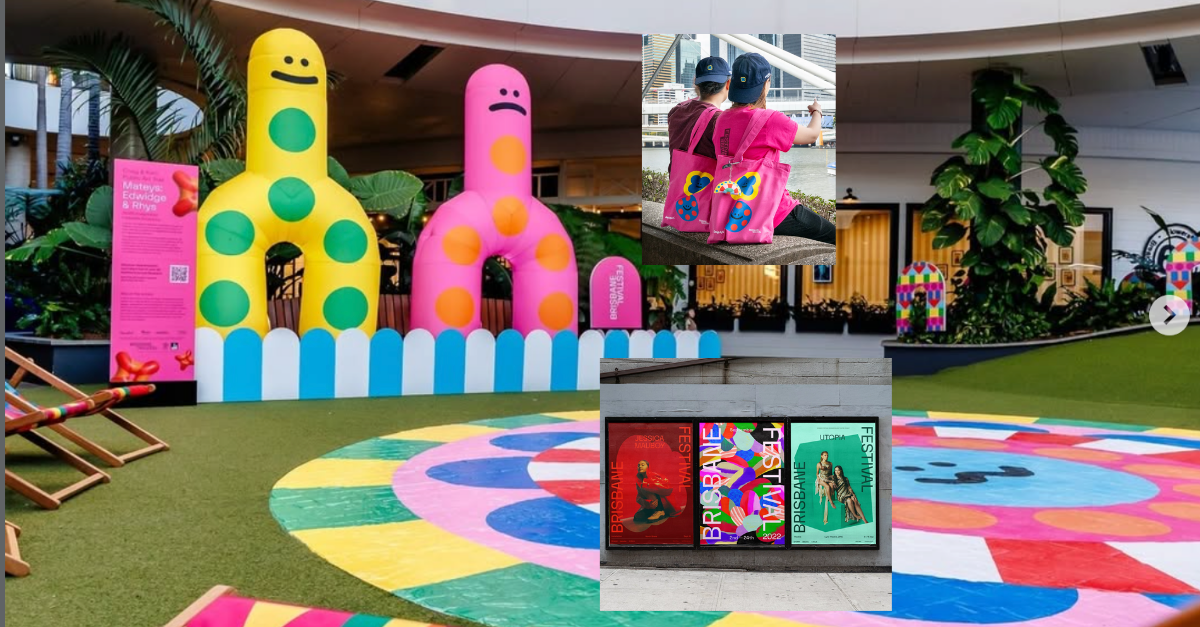
Brisbane Festival’s rebrand introduced that distinctive iridescent pink. The typography itself is bold and blocky, but not complex. What creates impact is scale, placement, and repetition. Posters, signage, digital ads all feel connected because the system is clear.
Takeaway 2: Create a simple brand system rather than one perfect logo. Decide how your logo sits on backgrounds, how headlines are styled, and how colour is applied. Document these rules so every piece of marketing looks like it came from the same place.
Strong foundations give bold ideas room to shine without visual chaos.
How do big brands command attention so easily?
They match their visual energy to their brand personality.
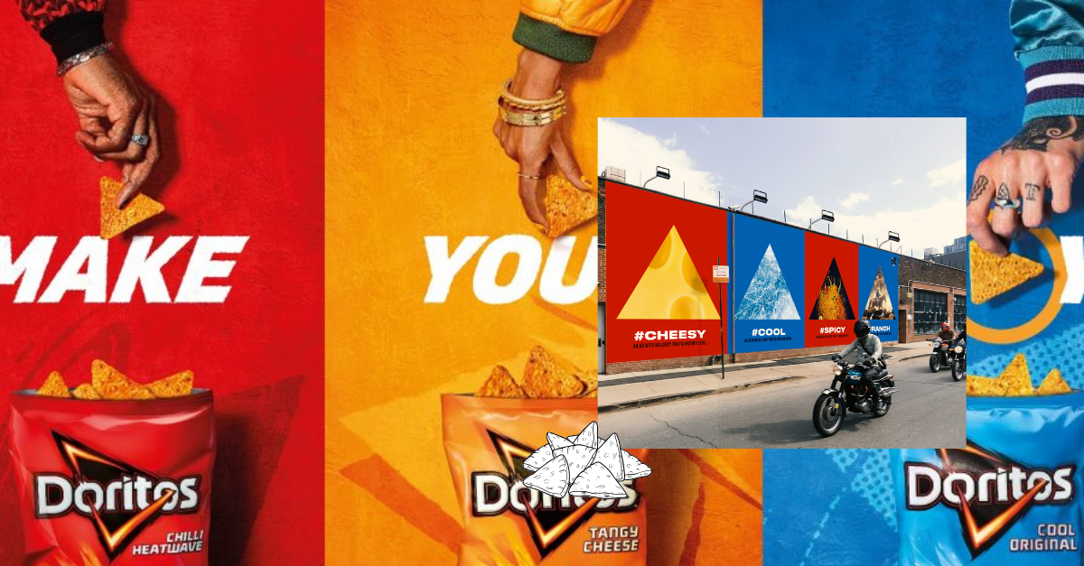
Doritos is a masterclass here. Loud colours, high contrast, oversized graphics, playful tone. Everything reflects the intensity of the product itself. You don’t just see a Doritos ad, you feel it.
Takeaway 3: Align your visuals with the experience you deliver. If your service is high energy and fun, your brand should not look muted and corporate. If you deliver premium calm expertise, neon chaos may confuse people. Alignment creates authenticity, and authenticity drives connection.
When personality is this clear, attention follows naturally.
What is the real strategy behind unforgettable brands?
None of these brands are random. They pair bold expression with clear direction. Personality with consistency. Creativity with strategy.
Standing out is not about being louder than everyone else. It is about being unmistakably you, everywhere you show up.
If you suspect your business has outgrown its current brand or you are tired of looking like everyone else in your industry, it might be time for a rethink.
A strategic brand does more than look good. It attracts the right people, communicates your value instantly, and gives you confidence every time you hit publish.
If you are ready for that shift, get in touch via the form below and let’s explore what your brand could become.