5 Tips to Designing a Unique Logo that is Effective in 2023 and Beyond
Hey there! Let's talk logos. At its core, a logo is like a friendly face for a brand. Symbols, you see, they're like our ancient ancestors' way of sharing stories even before we had words.
We've always had this urge to connect with each other, to mark important moments and ideas with symbols – they're like our secret code, a universal language that speaks to everyone. But here's the twist: using symbols can be a bit tricky. They're like a quick sketch, appealing to the eye, but we need to make sure our message gets across loud and clear.
So, let's dive into the world of logos and find out how to make our brands' stories pop and sparkle!
Consider your Audience (& Your Nanna)
Let's dive into the fascinating world of logo design! The amazing thing about logos is that they're like little storybooks packed with meaning. Whether it's an idea, a process, or a concept, logos speak a language of their own.
But here's the fun twist – the way people interpret logos can be as diverse as a box of crayons. Just like the yin-yang symbol, which many of us see as a symbol of harmony. Yet, it's also about the beautiful dance between opposites, like day and night, or how 'up' only makes sense because we have 'down.'
It's like a secret message that reveals itself differently to each person, depending on their own unique experiences.
When brainstorming ideas for your Logo Design, one crucial factor to keep in mind is how they'll be seen through the eyes of your target audience and even by the broader public. It's like putting on different glasses to view your symbols from various perspectives – think like your grandma, your neighbour, your son, or anyone you can imagine. Better yet, why not just have a friendly chat with them? Testing your symbols through different lenses is a fantastic exercise to gauge how your logo will resonate with others.
2. Put Pencil to Paper
Once you've collected a bunch of ideas, it's time to put your creativity to work! The best ideas often start with a simple sketch on paper and then evolve from there. It doesn't matter if your initial drawings are masterpieces or just rough drafts, as they'll likely remain your little secret. What's important is getting those ideas out on paper to see how they come to life. To spark unique logo concepts, you can use a Visual Metaphor Matrix. It might sound fancy, but trust me, it's a straightforward process. Just follow these steps!
Capsule’s Visual Metaphor Matrix.
Identify the top attributes of the client’s message.
Identify basic visually descriptive words that anyone can understand.
Create a matrix by placing the attributes on one axis and the visually descriptive words on the other.
Create a visual representation of the two words together.
Carry on filling the matrix. Whether any specific one works or not is not really the point. At this stage you are just trying to fill the whole page.
3. Legibility and Understanding are a Top Priority
Legibility and understanding are two very important issues to consider when designing a logo.
When you embark on the journey of logo design, two vital factors come into play: legibility and understanding. Your logo will be seen in various sizes, from the fine details on a T-shirt to the grand display at your shop's entrance. That's why scalability is a top consideration when crafting your logo's icon and text. Your symbols should maintain their clear identity, regardless of size. This means they should look like what they represent, and you should weigh the importance of intricate small details in your design.
Take the example for this nursey; it's overly detailed, making it hard to recognise when scaled down, and the brand's identity gets lost in the intricate design.
But there's more to it than just legibility. After all, your logo's role is to not only be seen but also to be understood. It should convey a message relevant to your industry, ensuring that your audience comprehends what it represents. In this way, your logo becomes a powerful tool, unmistakably signalling your brand's identity and what it stands for.
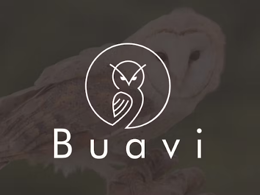
This owl design isn’t clear as to what the business is before you gain further context. It could be understood as a business to do with birds or owls, a business that operates at night, something to do with wisdom? Who knows… It’s actually a software company focused on the development of high end technology for CCTV. With a bit more context the owl makes sense (watchful owl) but it’s not until we find out more that we peace it together.
4. Keep It Simple
The role of a designer is to create designs that communicate to the intended audience quickly and easily. It's all about keeping things straightforward, and that's where the K.I.S.S. principle comes into play (Keep It Simple, Stupid!). I often remind myself of this, as I'm someone who tends to get caught up in ideas and carried away with flamboyant designs.
Let's take a look at the 'Slippery When Wet' sign to the left. At a single glance, without even reading the text, the viewer instantly grasps the need to exercise caution ahead.
5. Make It Memorable & Unique
When it comes to choosing the right symbol for your logo, it's all about thinking creatively and outside the box to ensure that your logo is not only unique but also easy to understand. There are three distinct categories of symbols you can explore to discover the perfect fit for your brand:
Images - These are direct representations of what your business is, what it does, or the services it provides.
Diagrams - These offer a visual abstraction of how your services work or how they are used.
Metaphors - These symbols share conceptual qualities with your business or service, or they align with something your business stands for.
The key is to make sure these symbols resonate with your business's core values and ideals, so your customers immediately grasp what you offer. Whether you choose a simple approach or combine two ideas, the choice is entirely yours.
Below, you'll find three logo options for opticians, each showcasing the three distinct symbol subclasses.
1. Literal Image of what the business offer: Glasses
2. Diagram of what the business does - eye examinations
3. The ideal outcome of going to the optometrist: A light bulb is a metaphor for being able to see (turn on the light in the dark and you can see!)
In conclusion, creating a unique and effective logo in 2023 and beyond is an exciting endeavour that can set your brand apart. Remember to always consider your audience, get your ideas down on paper, prioritise legibility and clarity, keep your design simple, and aim for memorability and uniqueness. For further guidance and inspiration, feel free to check out the following helpful sites I've linked below.
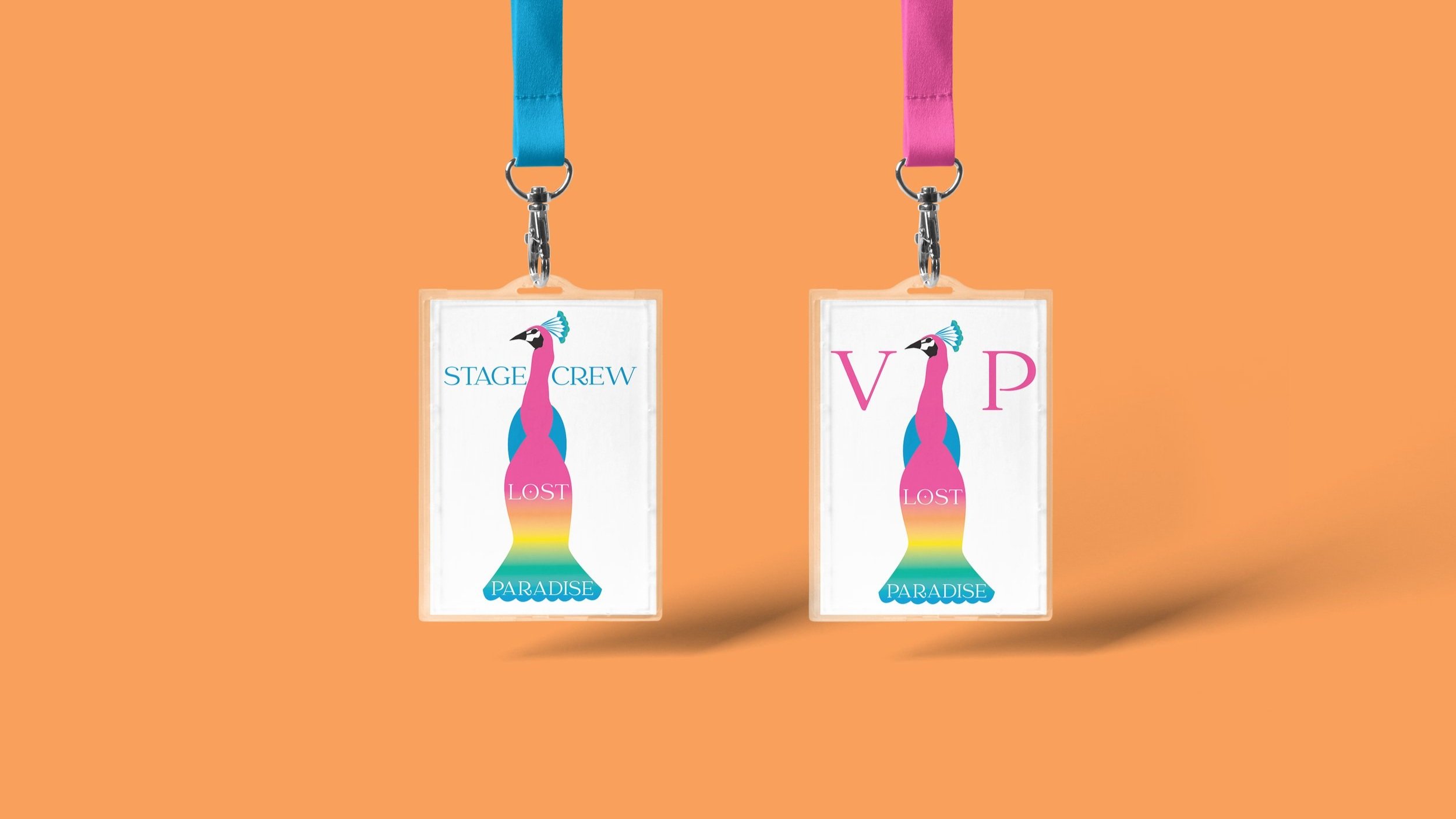
You can also check out some of my process when designing a logo by clicking through to my Brand Identity Design Project for Lost Paradise here.
I hope these tips will empower you to craft a logo that not only resonates with your target audience but also stands the test of time. Happy logo designing!
Things to Avoid in your logo design: https://99designs.com/blog/logo-branding/bad-logo-design/
General Design Tips: https://www.canva.com/learn/graphic-design-tips-non-designers/
Logo Design inspiration: https://looka.com/blog/logo-design-inspiration/
So now you know the basics to start thinking about your logo design, you can get thinking about what you want to include. Or if you’re ready for us to do the hard lifting for you, start your brand journey with aHa Creative; we will take care of all these considerations and more.
Get in Contact via the enquiry form below or click through to my Services page here to see how I can help you elevate your brand online and start booking the right clients today!


