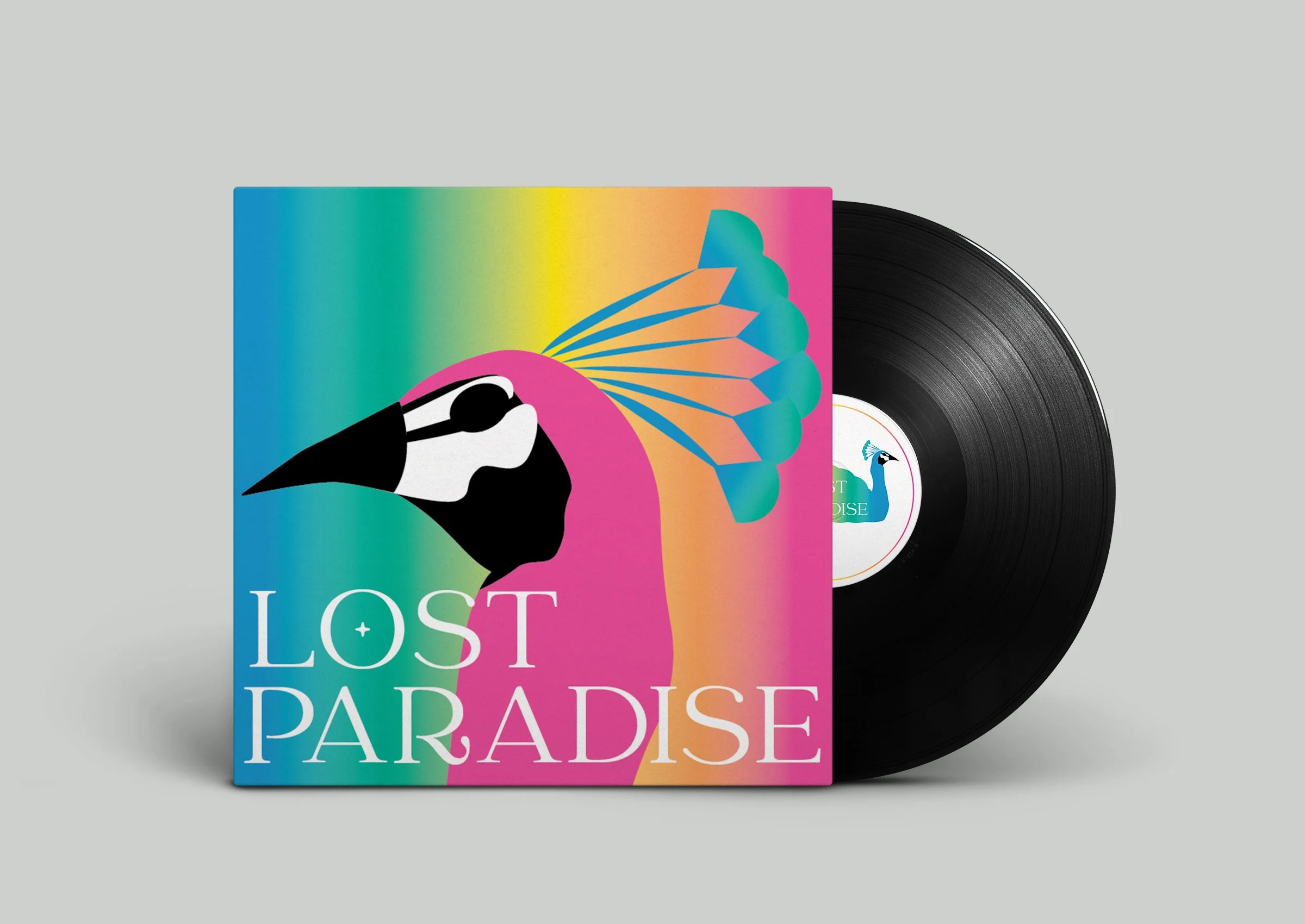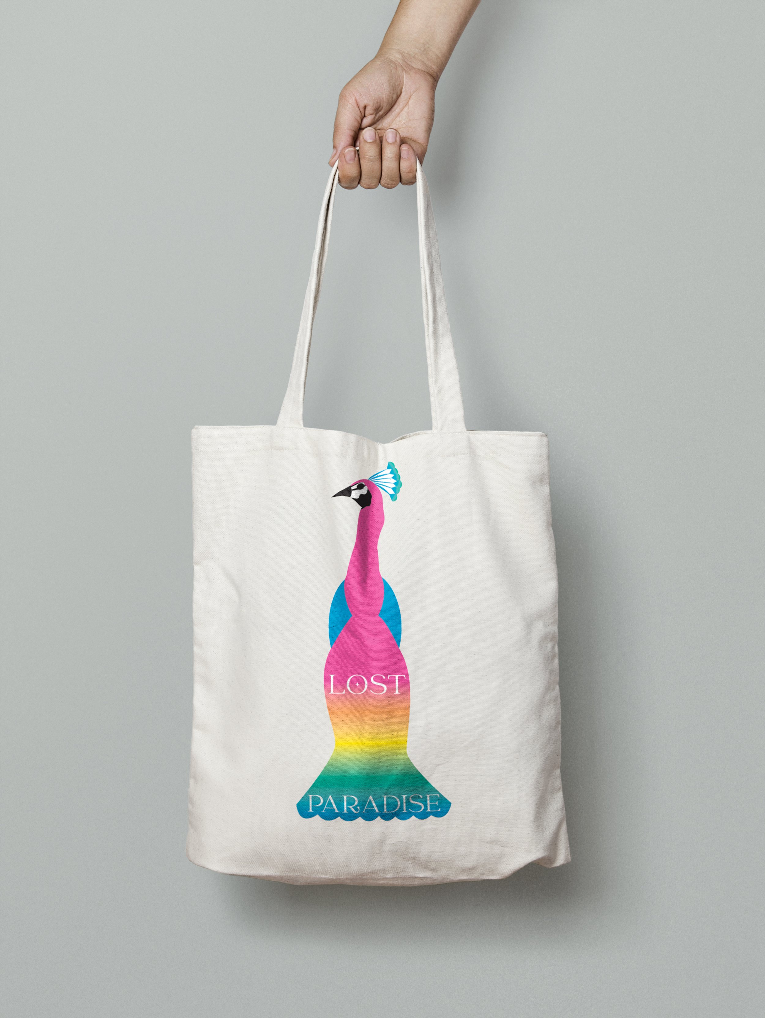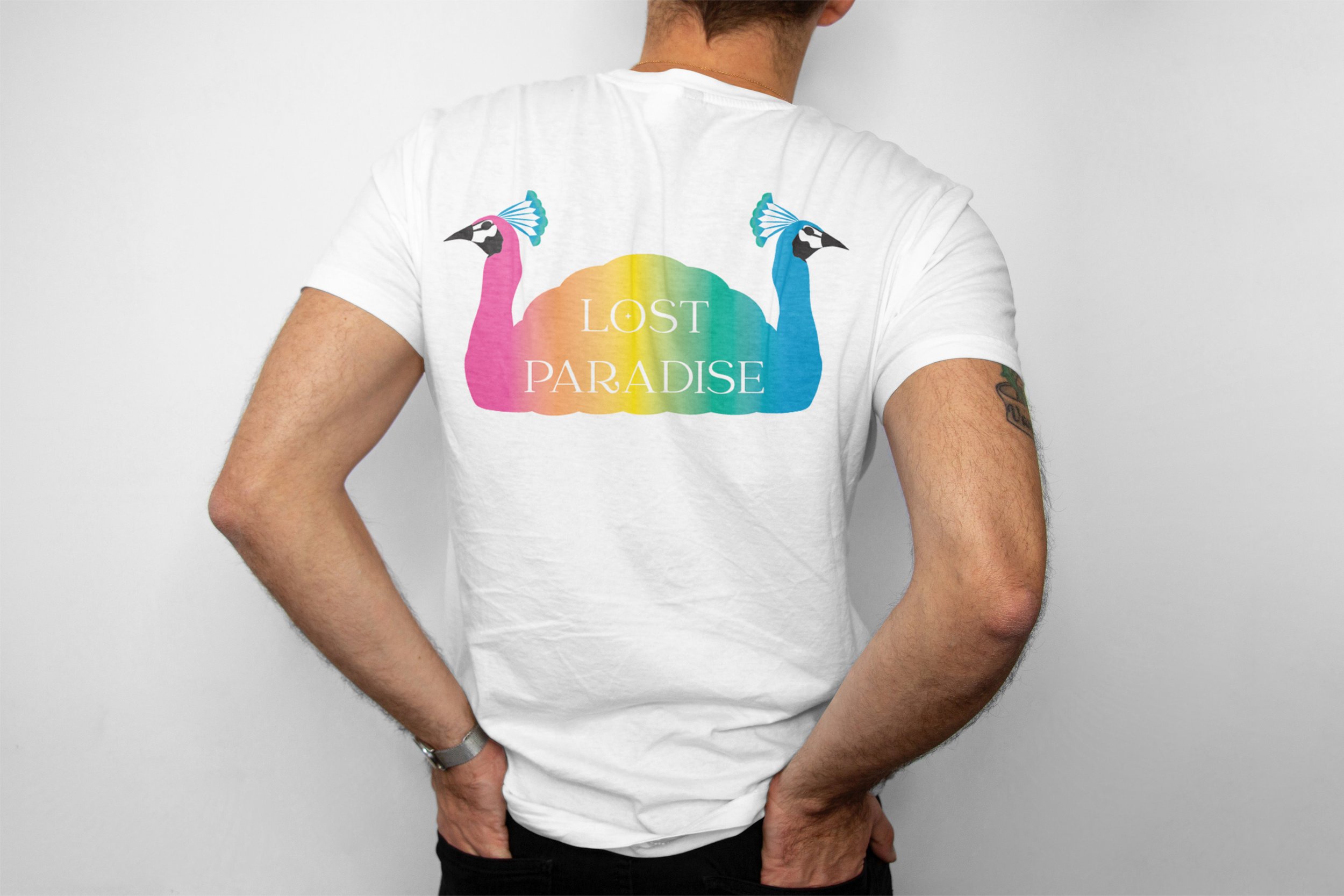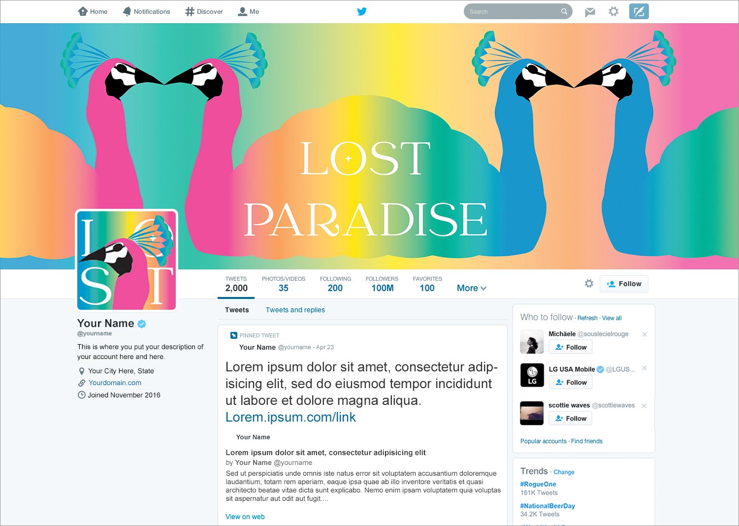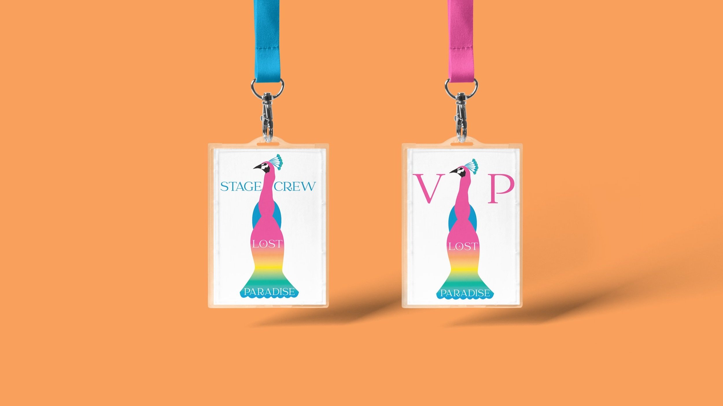
Here, we developed a comprehensive re-brand and supporting collateral for music festival, Lost Paradise.
For this fun task, we created a new look and feel as well as logo in multiple formats that would differentiate Lost Paradise from other events as well as reflect their vibe. As they encourage dress ups and get some pretty out there costumes, we decided to follow down the path of the peacock. After many refinements and consultation, we landed on this simplified version of a peacock with a rainbow tail in a colour blend that was both tranquil and energetic, like the festival.
